Monday, 16 January 2023

The Balls Pond Road cycle lane, how ‘safe’ is it for bicycles?

The cycle lobby has managed to persuade non-cyclists, who make up  the overwhelming majority of the population, that cycle lanes improve road safety. They now call them ‘protected’ cycle lanes. But this is hugely overstating the case for cycle lanes. One such lane is along a short section of Balls Pond Road on the Hackney, Islington border.

Previous coordinators of Hackney Cycling understood the problems of cycle lanes. The  one along the Balls Pond Road would be a bi-directional lane, (which are known to be problematic) and would only cater for cycles crossing the road on Cycle Superhighway 1, north to south via a dog-leg. It would make cycling more complicated for westbound cycles on Balls Pond Road and disadvantage eastbound cycles that had previously used the extant bus lane.


However, the wider London Cycling Campaign lobby and Andrew Gilligan determined that it must be built. The bus lane “wasn't used” said the vociferous cyclists. The effect on bus passengers didn’t count. There were delays in the scheme getting the go-ahead, but years of lobbying led to this 100metre bi-directional lane being built in October 2020 using plastic poles in the carriageway.


Recently, cycle lobbyists have made a fuss about the necessary closure of the Kingsbury Road bridge on the route of Cycle Superhighway 1. Islington Cycling have made a bold statement in a tweet about road safety.


And so I thought I would take a look at the TfL published collision data*


Below is TfL’s mapping of collisions from 2017 to August 2022. So there are 45 months of data before the cycle lane construction and 22 months after. In that time there have been seven injuries to cyclists, three slight injuries before construction and four afterwards (one serious and three slight). This equates to more than double the collisions per year!


Alongside the mapping, TfL publish the dates and other details of the collisions.


There are  multiple factors that might explain this huge increase in cycle injuries. The cyclists will point to some additional cycle journeys. The anti road closure campaigners will cite additional traffic. Both are valid, to a degree, but neither, realistically explains the scale of the increase in casualties.


The reason for the increase in collisions will, in part, be because of the cycle lane, and particularly the two-way nature of its junctions at Kingsbury Road and Culford Road with Balls Pond Road. This, together with the narrowing of the carriageway, (which exposes cyclists westbound on Balls Pond Road to closer passing vehicles), makes a mockery of claims about ‘safer cycling’


If one considers all injuries, not just cyclist, along this short stretch of road, there were 13 in total. 5 before construction of the bike lane, 8 after in the same time period described above. There were two serious injuries. One being the previously observed cyclist and the other a pedestrian, both after construction of the bike lane. So, again, a much worse collision record.


To conclude. This cycle lane may well be linked to there being more collisions than prior to its construction. It may give a sense of protection for cyclists, but in fact is less safe. Traditional data-led interventions would be much more beneficial to cyclists and mean both more and safer cycling.


https://app.powerbi.com/view?r=eyJrIjoiNzgyZTc0ZmYtMjlmOC00ZGFmLWJmNzMtZWJkMjdhMDU4MGY1IiwidCI6IjFmYmQ2NWJmLTVkZWYtNGVlYS1hNjkyLWEwODljMjU1MzQ2YiIsImMiOjh9


Friday, 23 December 2022

TfL’s London wide cycle count - What can it tell us about cycling in London? Part 3, inner London

This is the third of three blog posts analysing TfL’s London wide cycle count. The count has been running since 2015 and is divided into central, inner and outer London, with over 1000 sites across London, and over two million items of data. It is designed to estimate the volume of cycling for the whole of London and so has some limitations when considering individual sites and counts. Nevertheless, it provides a fascinating insight into, and compelling evidence of, what is happening to levels of cycling in London.

In the previous analyses it was clear that central London cycle levels declined between 2019 and 2021, whilst in outer London cycling increased somewhat. But the forecasts of a 10 fold increase, propaganda suggesting 200% rises from the Mayor of London and his cycling Commissioner, Will Norman are demonstrably wrong.

The data is available at: https://cycling.data.tfl.gov.uk/.

Inner London

Tfl has previously reported the change in volume of cycling between 2019 and 2021 in its annual statistics report, Travel in London 14, as a rise of 4.6% in inner London using this data. In the most recent Travel in London 15 report there isn’t a figure, but from a chart in the report, they look to have increased their estimate to about 10%. Below is an analysis of the inner London count, which shows some growth in inner London between 2019 and 2021, but again no ‘boom’.


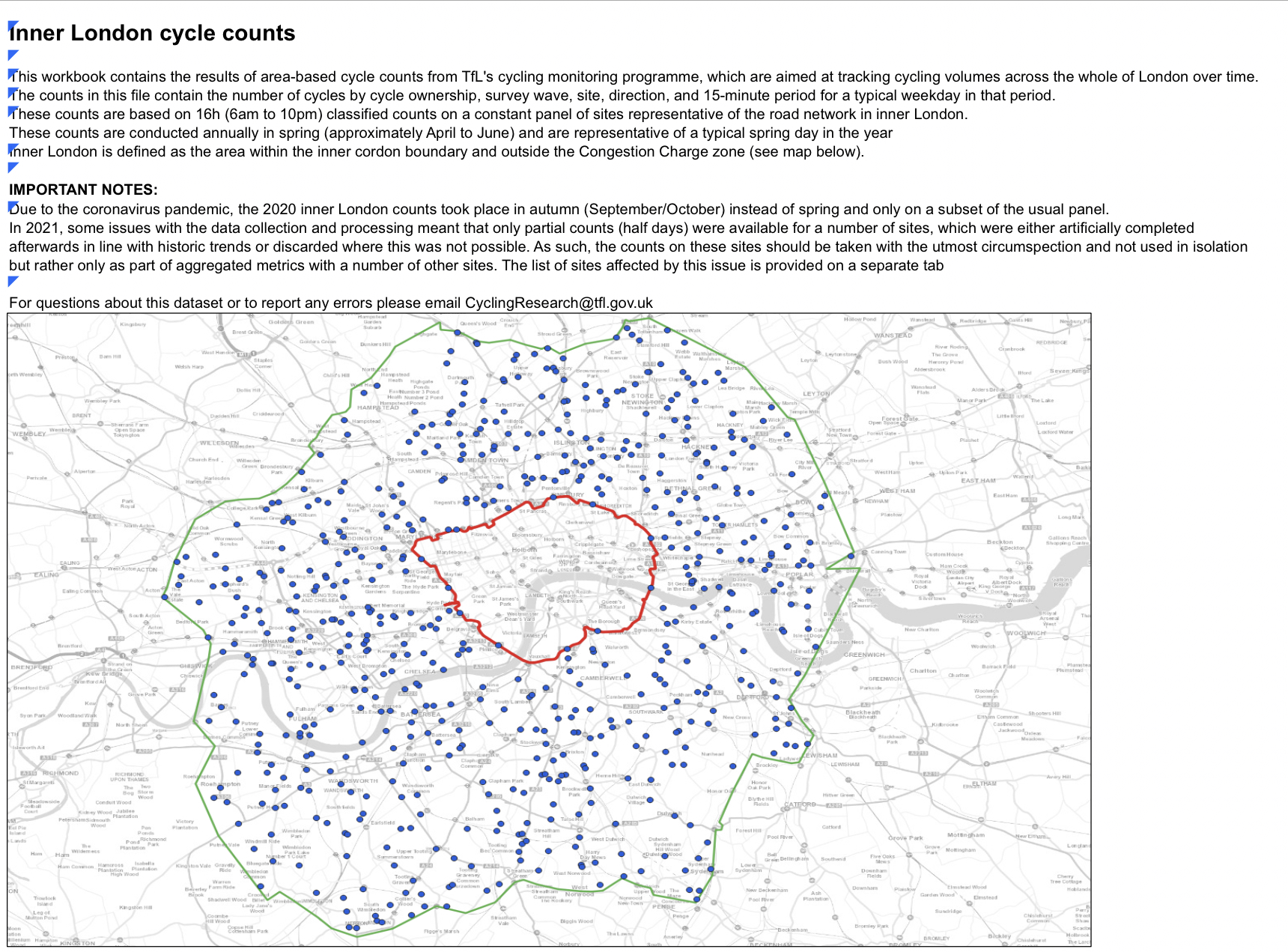
There are 650 inner London count sites. The counts have been undertaken every spring since 2015 except in 2020 when, because of Covid, a subset of sites were counted in the autumn. Only Mondays to Fridays are counted for a 16 hour day, 6am till 10pm*. Below is an image from the TfL report showing the count sites.


Looking at all the counts, the median shows the central change between 2019 and 2021 was an 11% increase in cycles.


An interesting set of counts is of the inner London bridges because they effectively route all cycle traffic over a wide area onto the same road to give a more consistent count over the years. Hammersmith Bridge was not counted in 2020.


The most interesting of the individual sites are the busiest cycling streets. Comparing 2019 with 2021 for the busiest 10 inner London counts in 2019 shows a spread of change from an increase of +33% (Kingsland Road) to a decrease of -61% (Chelsea Embankment).


It is interesting in the era of ‘working from home’ to look at the amount of commuting as a a proportion of daily cycling. Below the chart represents the morning commute measured as the count between 7am and 10am compared to the whole day. All commuting (to and from work) will be double this percentage.

Of course leisure cycling is a good thing, but it doesn't generally contribute to congestion reduction at the peak hours which is a key issue for cities.


Hackney has a uniquely high mode share for cycling and so is especially interesting. Below is the chart of all its inner London count sites. Particularly striking is the high levels of cycling on the A10, that many from the new cycle lobby say is too scary to cycle on!


Selecting roads that have been nominally improved for cyclists and comparing these to the TfL road, the A10 through Hackney, its difficult to make a case that the lines of plastic poles on Green Lanes and Queensbridge Road have made any difference to cycling levels.


Conclusion


Overall cycling has increased (from a very low base) on weekdays in inner London between 2019 and 2021. My analysis shows the central figure of all counts to be an increase of 11%.


There is no evidence of a cycling boom in inner London, despite the Mayor of London and his Cycling Czar, Will Norman commentary. This growth is on a very small base and known to be limited to a small demographic of London’s population. On the face of it, the growth is in cycling for leisure.


Notes

* There were some errors in the data reported by TfL and I noted some duplication in the published figures. I have left out the sites TfL had problems with, but I have been able to correct those where there was duplication.

Saturday, 15 October 2022

TfL’s London wide cycle count - What can it tell us about cycling in London? Part 2, outer London.


This is the second of three blog posts analysing TfL’s London wide cycle count. The count has been running since 2015 and is divided into central, inner and outer London, with over 1000 sites across London, and over two million items of data. It is designed to estimate the volume of cycling for the whole of London and so has some limitations when considering individual sites and counts. Nevertheless, it provides a fascinating insight into, and compelling evidence of, what is happening to levels of cycling in London. 

In the the previous blog post looking at central London, cycle volume declined between 2019 and 2021. The propaganda of the Mayor of London and his Cycling Czar is that cycling is booming. It is not. Below is my analysis of the outer London count.

Outer London

In outer London Tfl reported the change in volume of cycling between 2019 and 2021 in its annual statistics report as a rise of 19.9%. Below is an analysis of the outer London count, which shows some growth in outer London, but hardly a boom.


There are 451 outer London sites. The counts have been undertaken every spring since 2015 except in 2020, because of Covid, when a subset of 200+ sites were counted in the autumn. Only Mondays to Fridays are counted for a 16 hour day, 6am till 10pm.


Looking at all the counts, the median shows the central change between 2019 and 2021 was a 16% increase in cycles.


The most interesting of the individual sites are the busiest cycling roads. Comparing 2019 with 2021 for the busiest 10 outer London counts in 2019 shows a spread of changes from an increase of +46% to a decrease of -36%.


For further context below is a chart showing all the Chiswick High Road counts since 2015. All were conducted in the spring, bar the 2020 count, conducted in the autumn. On the face of it most of the rise in cycling occurred before the installation of the bike lane installed in December 2020. 


Note: A recent tweet from the London Cycling Commissioner, Will Norman, implied that the rise was BECAUSE of the bike lane.


Below a chart of the other busy sites.


It is possible to select out the counts by the hour. Below the chart shows commuter cycling during the morning peak hours (7am til 10am) in comparison to the whole day (6am til 10pm). Commuting is flat, suggesting the increase in 2020 and 2021 is non-commuting.


Below another set of sites that are around the median change between 2019 and 2021 of +16%. These give a fair sense of what is happening overall.


And finally, a sense of cycling gender can be gained as the count enumerators noted gender of the cyclist in the outer London counts. The figures vary greatly from site to site and year to year, but the median figure is 13% female.


Conclusion


Overall cycling has increased (from a very low base of less than 2%) on weekdays in outer London since 2015. Particularly, cycling rose between 2019 and 2021 during non-commuting hours. TfL calculate the increase in cycling volume as 19.9%. My analysis shows the central figure of all counts to be an increase of 16%, which is quite similar. On the face of it, the growth is in cycling for leisure.


There is no evidence of the much vaunted cycling boom that the Mayor of London and his Cycling Czar, Will Norman have stated repeatedly, despite the many millions spent on this niche mode, and the neglect of other modes.

Saturday, 24 September 2022

TfL’s London wide cycle count - What can it tell us about cycling in London? Part 1, central London.

Cycling is important to the city and, albeit a minor mode, growing cycling is important. But growth seems unlikely to be achieved simply by the Mayor and his Cycling Commissioner overstating the importance of cycling as a mode and making overblown claims that cycling is booming when it isn’t. Rigorous analysis and policy making are needed and there hasn’t been any since Mayor Johnson and Andrew Gilligan's 2013 ‘Vision for Cycling in London’ report.


In this blog and two later ones I will try to show how TfL has access to good data that should enable the sound analysis and policy development that responsible authorities would undertake, how the existing data is being misused, (claiming trends, when it simply cannot be called a trend),  and, hopefully, provide a basis for some thoughtful reflection.


TfL does a lot of things very well. One has been to establish the London wide cycle count in 2014 on which I was privileged to be briefed. It's disappointing that having this data and the officers to interpret it, there is so much spin and propaganda associated with the statistics of cycling and too little effort to understand and inform.


Analysis of the data shows that tweets like the one below talking about cycling booming and 200%+ increases in cycling associated with bike lanes is nonsense, at least in policy making terms. The tweet comes from an official spokesman of a public body and has distorted policy making, led to mistaken decision making and to a huge waste of public money and a much poorer bus service and pedestrian environment.


The 200% claim was based on comparing two weekends in February

TfL has 8 years of data for central London and 7 years for inner and outer London. (Counts are separated into central, inner and outer London). The count is a gold standard count of cycles conducted across the whole of London with over 1000 count sites and over 2 million items of data. Central London is counted quarterly, inner and outer London annually. The count is taken on Monday to Friday, between 6am and 10pm.


Outer London count sites


It is well known that cycling levels are subject to great variability. The DfT describes cycling as ‘having a relationship with the weather’. But levels are also subject to variability by season and day of the week. Tuesdays are busier transport days than Fridays which in turn are usually busier than weekend days. Schooldays are busier for all transport modes than non-school days. 


To reduce this variability, though it can't be eliminated, the TfL count keeps clear of school holidays, compares the same quarter each year, counts each site across 16 hours on multiple days.


So it’s a great count designed for a London wide result of ‘kilometres cycled per kilometre of road’ (towpath, on and off-road cycle tracks etc. are included). Nevertheless there is a big health warning when comparing single sites and one count with the next. One year's increase or decline could be entirely due to the weather, road works etc. or just chance.


This is the first of three blogs and covers the central London counts.


Central London


There are over 200 inner London sites counted quarterly. Q2 & Q4 2020 & Q1 2021 are missing due to COVID. Q3 has been undertaken throughout. Central London has the highest density of cycling.


As an example, Appold Street is Hackney’s only central London site. Below is a chart derived from all the counts available and shows the gaps due to Covid. To a degree it shows the variation by season.


The second chart below uses the same data, but uses just the Q3 counts. It is more intelligible. It covers all 8 years including the only quarter, Q3, undertaken in 2020.  So although there are fewer results, it reduces the seasonal variation.


More interesting are the counts from the 6 central London bridges. The Thames acts as a traffic cordon for all trips to and from the south of the river into central London and so provides a proxy for cycling activity in central London. Below are the Q3 counts from 2014 to 2021.


Below, covers the same time period, but just the morning peak hours (7am til 10am). And so you get a sense of commuter cycling, which constitutes a large part of all cycling, particularly in central London.


I have added all 6 bridge counts together which probably gives the best sense of the change in cycling levels in central London.


Finally all the quarter counts of each central London bridge and an average of the total 6 bridge counts on one chart. It is very obvious that cycling in central London hadn't boomed before or after Will Norman's 200%+ tweet.


An overall sense of the change in cycling in central London can also be gained by looking at the change (positive and negative) of all the 200+ central London counts. The median change (a type of average) between Q3 2019 and Q3 2021 is -17%. I removed a couple of outliers.


TfL’s Travel in London report 14, its annual statistical almanac, reports the overall cycle volume for central London as decreasing by 16.4% between 2019 and 2021.


Three more counts showing changes of large negative, large positive and zero percentage change in cycling count between 2019 and 2021.


Conclusion


It’s clear from looking at these counts that there has been not been a 200% + increase in cycling in central London associated with cycle lanes contrary to the claim made by the cycling commissioner in his tweet. Policy is being made at best on the basis of misunderstanding, at the worst it is deliberate distortion. Huge sums of public money are being wasted and misdirected when money could be usefully spent on more impactful ways to change travel behaviour and make our roads safer for everyone.


Wednesday, 25 May 2022

Inclusive cycling- what can we learn from the Kingsmead Estate in Hackney?

The cycle lobby and bloggers have managed to establish that there is a simple link between road safety and levels of cycling. They suggest many would rush to cycle if only the road network ‘felt’ safe. They use the phrase ‘build it and they will come’.
They are able to sustain this argument because very few people cycle and little independent research has been undertaken. The research available has been undertaken by lobby groups in the main. And what research there is relies on surveys of attitude and sentiment. They ask respondents what they 'might do' rather than researching what they 'actually do'. In the words of Werner Brög, Social researcher and well know travel surveyor, “attitude is not behaviour”

The study I have undertaken is very different. It is an analysis of two communities in Hackney living cheek by jowl and using an identical local road network. The data is from the 2011 Census and as such is of unimpeachable quality. The analysis finds huge a difference in cycling levels between two communities that share identical access to the local road network. It debunks the cycle bloggers mantra of ‘build it and they will come’. The challenge for those advocating inclusive cycling is to understand why this is.

The analysis finds that comparing two adjacent census areas in Hackney one, ‘the leafy streets’, has the third highest (25.6%) cycling to work levels in Hackney. This compares to the adjacent ‘inter-war and 80s housing estate’ with the second lowest (3.6%). Both share an identical local road network. This is a seven-fold difference in cycling levels. The housing estate is the most bus dependent in the borough.

The two communities.

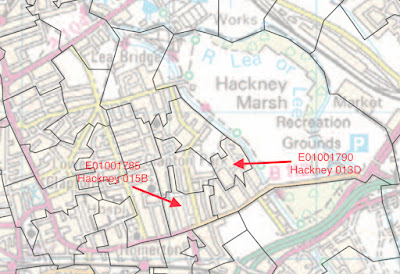
The map below is of the census areas which the Office of National Statistics (ONS) call Lower Level Super Output Areas (LSOAs). There are 144 such areas in Hackney. They will have between 400 and 1200 households each and are shown here with their ONS reference numbers.

Two adjacent Hackney LSOAs 

The 144 LSOAs have vastly different travel to work by cycling levels. The highest being 27.5% down to 3.1%


The first community live in Victorian terrace housing on leafy streets, just off the Homerton Road. There is little through traffic. Homerton Road is not one of London’s thundering roads. It is a  narrow primary route, the B112, often busy, but slow flowing road. It has a speed camera indicating past serious collisions. It is an important bus corridor. Access to the wider road network to the north and west, where most local transport objectives would be, is via Homerton Road or the wider traffic filtered area of Lower Clapton.

The second adjacent community lives on an inter-war and 80s housing estate that was a Hackney council estate and former timber factory, but is now managed by housing associations. It is set further back from the Homerton Road than the leafy streets and there is again little through traffic. In all other ways access to the local and wider road network is identical.

It’s clear that these two areas share the same road network. Both are within the red circle on the map below.


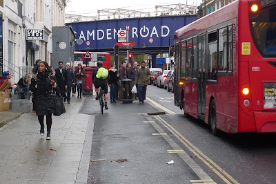
The leafy streets

This photo is a reasonable representation of the leafy streets.

The leafy streets


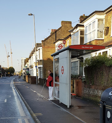
The inter-war and 80s housing estate

This photo represents most of the housing on the Kingsmead Estate.

The inter-war housing estate, Kingsmead


The demographics

The leafy streets community is 66% white, of whom 34% cycle to work. 43% commute by Underground, rail or bus; 13% by car whilst 11% work from home.

The second largest ethnic group are black (17%) of whom less than 3% cycle to work. Most (62%) commute by Underground, rail and bus; 25% by car whilst 8% work from home.

Overall 43% have access to a car, 21% travel to work by bus, 26% by cycle, the third highest of any LSOA in Hackney.

The inter-war housing community is 53% black of whom less than 4% cycle to work. Most others (74%) commute by Underground, rail or bus (50%), 14% by car whilst  5% work from home.

The second largest ethnic group are white (27%) of whom 9.5% cycle to work. Most others (60%) commute by Underground, rail and bus and 20% by car whilst 6% work from home.

Overall 35% have access to a car. 46% travel to work by bus, making it the most bus dependent community in Hackney. 4% cycle, the second lowest rate of any LSOA in Hackney.

Looking for an explanation

So what are the differences between these communities that so impacts cycling levels, beyond the housing form and ethnic group. The Census allows further analysis by cross tabulating several different characteristics within each LSOA.

Ethnic group and cycling

If you plot cycling levels against % of white commuters it seems there is a correlation, though some of the highest % of white population has the lowest cycling rates. I think this is associated with the Charedi community in Stamford Hill.


Socio-economic group and cycling

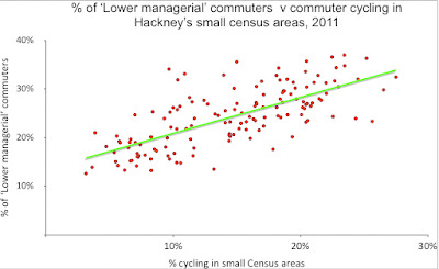
Here cycle to work levels are plotted against a Census socio-economic classification.

 Occupation and cycling

In a similar way to socio-economic classification, high cycle to work levels correlate with high percentages of professional occupations.


Access to car and cycling

Unsurprisingly better off residents own cars and so given what we have learned above its not surprising that higher levels of cycling are associated with car ownership, though this will be depressed in Hackney due to its car free planning policies.


Conclusion

It is clear from this analysis that the central proposition of cycle lobbyists is not true. if politicians and sensible policy makers continue to unquestioningly follow their lead they will continue to fail and cycling will remain the preserve of those living on the leafy streets.

Monday, 13 December 2021

Access denied, How providing for cycling has left disabled people with less access to bus services

One of the things one picks up early from working in transport and talking to older and disabled people is that they fear cycles on the pavement. And so for many of those working on streets policy it has been shocking to see TfL and other highway authorities divert cycles through bus passenger waiting areas at bus stops. This has been reinforced for me when working alongside disability groups who complained of being ignored and at a Hackney council scrutiny committee when the RNIB told us blind people could not use these stops. 


And to recently read that TfL’s own internal disability advisory group described one bus stop design as a ‘turd’, is more shocking still:

However, there was also strong agreement that this design was, in essence, ‘polishing a turd’ i.e. it was still a turd, but a better one.

The introduction of accessible buses and bus stops has been a key task of the last 30 years. This is because the bus is the most inclusive and affordable public transport, operating 24/7 across the whole of greater London. Any notion of social justice in transport starts with improving access to public transport, primarily the bus.

We know there will be any number of bus passengers at these stops that are either elderly or disabled. There will also be other passengers not in these groups, for example those pushing a buggy or alighting with multiple small and energetic children. All have benefited from legislation and action to improve access to the bus.


How did we get into a situation where £100s millions has been spent over decades on accessible buses and £10s millions to provide accessible stops? How have public bodies, such as TfL, been able to avoid their legal duty to older and disabled people to ‘advance equality’? Are they in fact allowed to disadvantage disabled people who need to access the bus from the pavement in such a manner?


TfL describes the negative impact of their bus stop designs on disabled people in its equalities assessment. And so they understand the problem. They say:


This may increase the potential of interactions between cyclists and pedestrians. Pedestrians who have cognitive, mobility and sensory impairments are more likely to suffer from the negative effects of the increased degree of cyclist / pedestrian interaction. In addition, the amount of manoeuvrability for wheelchair users may be more restricted to accommodate the cycle track as there may be less space.


And on older people:


This may increase the potential of interactions between cyclists and pedestrians. Pedestrians who are over 65 and have restricted mobility or are blind / partially sighted are more susceptible to potential cyclist / pedestrian interaction.


Which all means that older and blind people along with, say, autistic children, and those that use wheelchairs will be put off using the bus. And in some cases may well be injured because cycles, travelling at speed*, are diverted through bus stops.


Understanding how this has been possible requires an understanding of the history of equalities legislation. But in short the 1995 Disability Discrimination Act  that focussed entirely on disability, was repealed and replaced by the Equalities Act 2010 with 9 ‘protected characteristics’.

Age

Disability

Gender Reassignment

Marriage and Civil Partnership

Pregnancy and Maternity

Race

Religion and Belief

Sex

Sexual Orientation


And this has meant that instead of worrying about the access needs of older and disabled people getting on and off the bus, TfL has been able to mix it up in their assessment and balance off the needs of any group that is under represented in the demographics of cycling. Thus, TfL say:


there are benefits for all ages:


It is anticipated that introducing a segregated cycle track will encourage cycling growth among people of a wider age range;


disabled people benefit:


Cycles can act as a mobility aid for a small number of those who find walking difficult or cannot walk at all. Some people with disabilities ride standard bicycles; others use one of the many types of non-standard bicycle available such as tandems, tricycles, hand cycles or electric bikes;


women benefit:


With women making up over 50% of Hackney’s population, improvements to the infrastructure in the area to create a feeling of safety is likely to achieve higher levels of active travel for women;


there are benefits for ethnic minority communities:


This forms part of a series of measures to help open up cycling as a viable mode of transport to a larger number and wider range of people. BAME groups are typically under-represented in cycling at less than 7% of all cyclists in London, with the lack of facilities and safety concerns associated with traffic key barriers to cycling for BAME groups according to a TfL report;


those having undertaken gender reassignment benefit:


Implementing these measures is likely to deter people from committing crime, which may have a positive impact on people that have undertaken gender reassignment; 


And so it goes on.


TfL and other highway authorities have, in effect, said that they can now set aside the access needs of older and disabled people in favour of all of those that might cycle if cycle lanes were routed onto the pavement and through bus stops (None of which is substantiated).


So legislation designed to advance the needs of all equality groups is now disadvantaging those with disabilities and it is no longer the case that disabled people’s access to bus services is a priority.


This can’t be right!